
WTR
Logo , Label & Package Design
📍Cairo, Egypt
Context
Nutri Lu, a wellness-focused F&B startup, approached me to design the logo for WTR, a product envisioned to expand across multiple lines including protein, hydration, and vitamins. The identity needed to be flexible enough to support both current and future product extensions. Following the logo development, a label for the initial Protein Water line should be designed with the intention of standing out on supermarket shelves.
01
↓

🚩The Challenge
At the time the Protein Water logo was created, the category was new to the market with no direct competitors. The challenge was not only to design a recognizable identity, but also to help introduce and educate consumers about the product category.
🔍 RESEARCH
Throughcompetitor communication analysis, I identified several insights about the primary target audience and consumer persona, which later informed the visual direction and design decisions of the project.
🔍 Insights
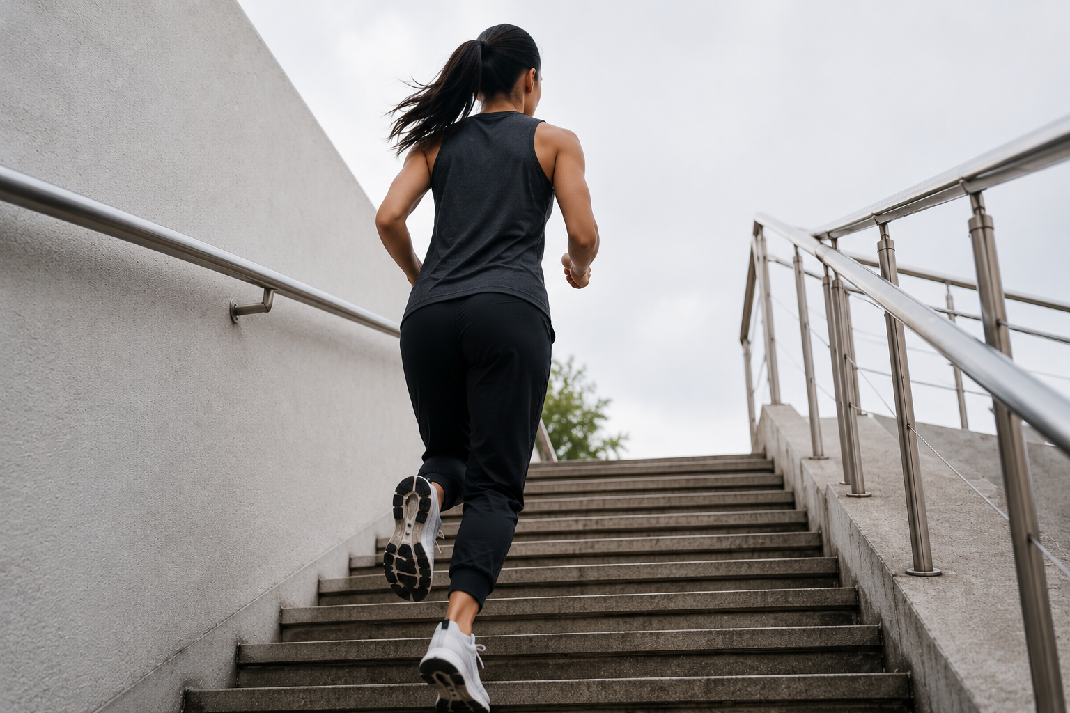
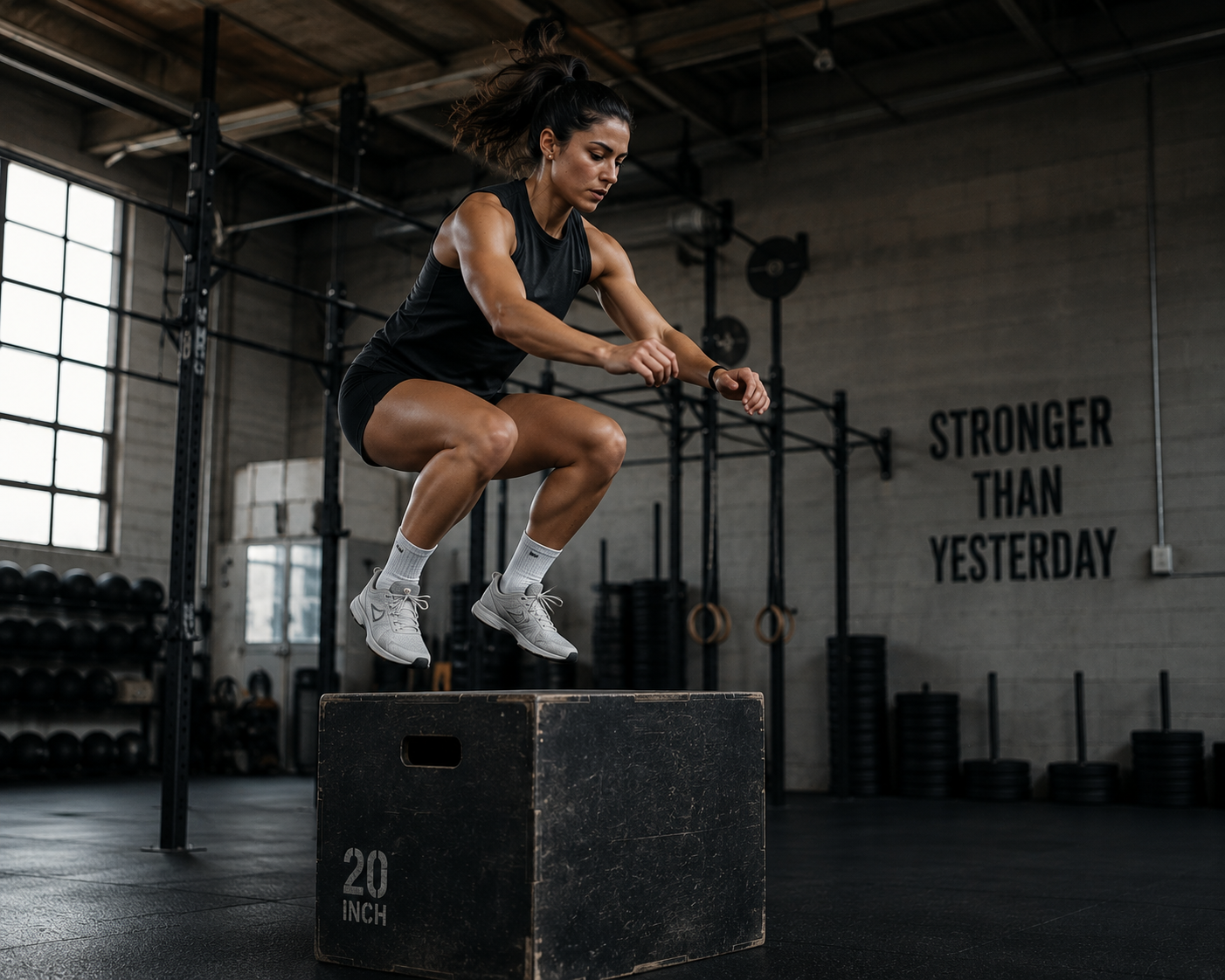
🧠 Wellness Mindset
Young millennial woman has a strong wellness mindset to stay positive and prevent depression. They believe that taking good care of their body through exercise and nutrition leads to a healthier mind.
💪 Cultural Shift
More young millennial woman are becoming fitness enthusiast embracing high intensity training such as CrossFit, weightlifting and running.
🎨 Modern Gender Neutral Aesthetics
Young millennial woman are moving away from gender oriented colors and moving towards contemporary aesthetic with gender neutral aesthetics
03
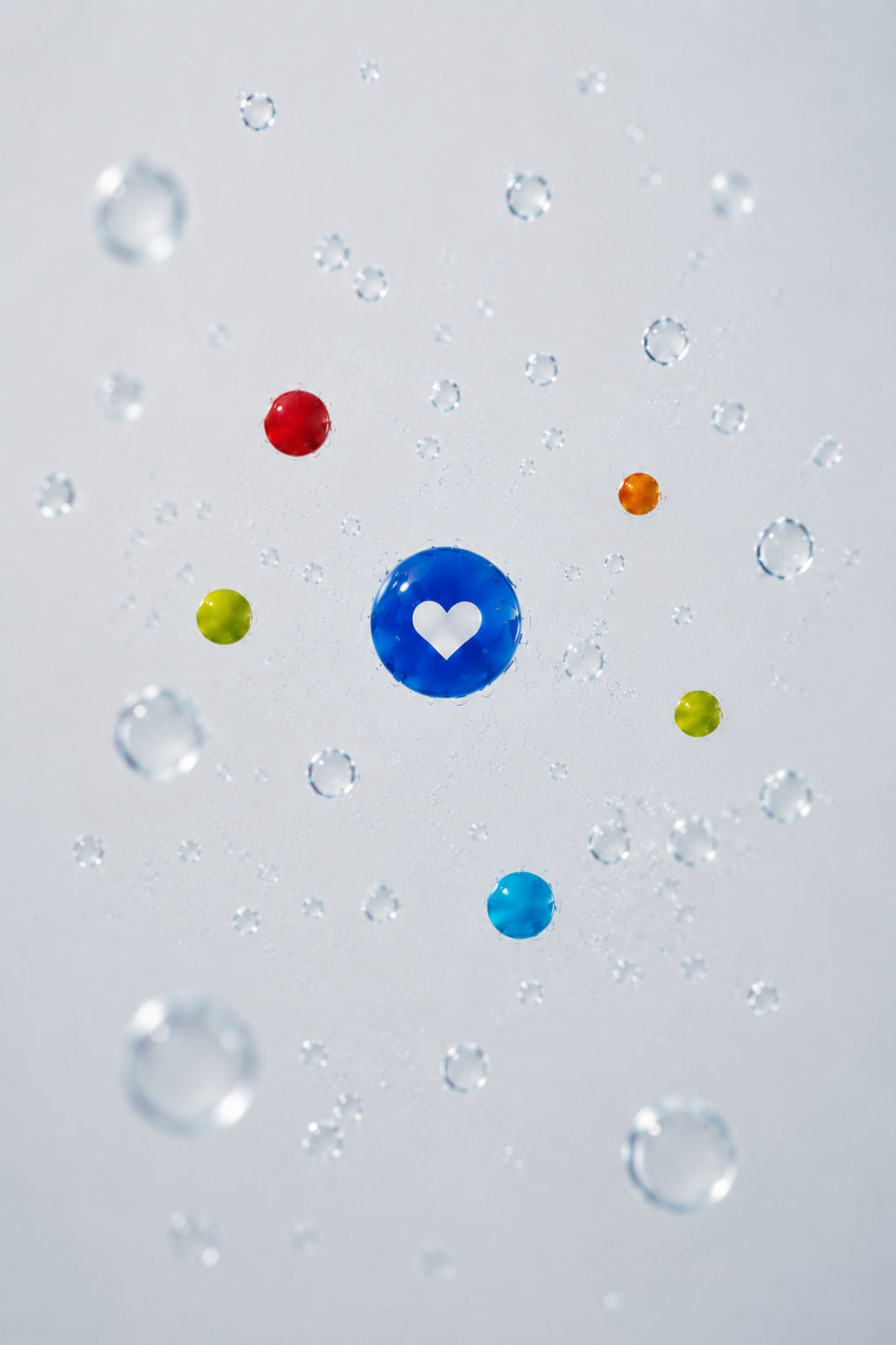
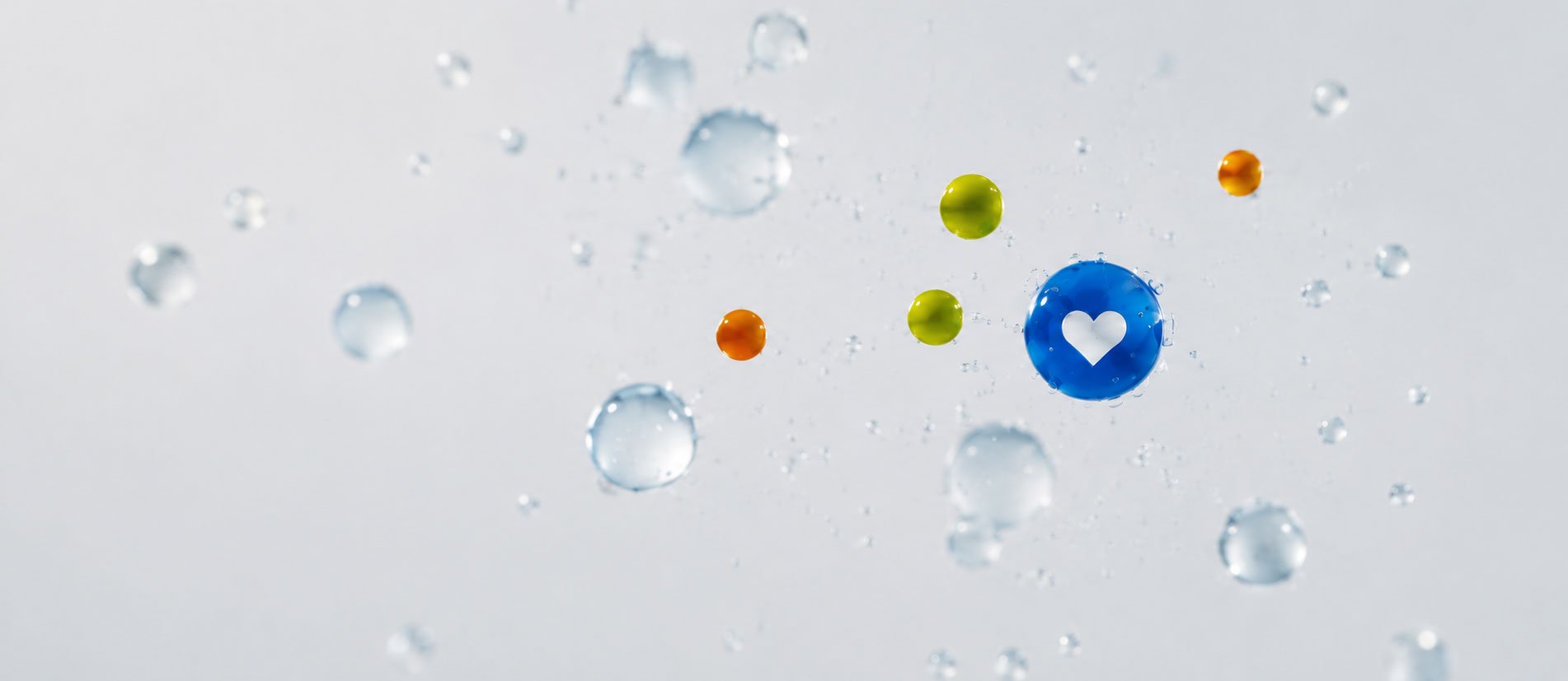
Concept
Particles that make up water, protein, and future product line extensions.

Health and Wellness

Protein

The gradient reflects the fluid transition between water and nutritional enhancement.
Protein
Hydration
Vitamin
The particles above the health and wellness symbol represent the nutritional enhancement added to the water. Their colors change depending on the nutrient and product line variation.
04
Protein
Water
Wellness
Label Design
05
Packaging
06